I'm proud of my involvement with the GnoMenu project and even though I am going to use it as the example (when you write, go with what you know) this post really isn't about GnoMenu. Rather its to show what community involvement can do and how sharing ideas can improve a project.
First off any GNU Open Source project is a community effort. Yes there are project leaders but if they do their jobs right its more about guiding and moving the project in a forward and positive direction. That is exactly what happend in the scenario I'm about to discuss.
First lets be honest GnoMenu is a fork of another project the "Gnome Vista Start Menu" by Chris Hughes. Most hard core Linux users looked at the menu Chris did as a cheap Vista look alike. In some ways it was but Chris also stated that other menu designs were possible yet no one really bothered to pay attention. Well almost nobody. Enter Helder Fraga who took Chris' work and forked it into GnoMenu.

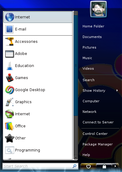
This is the original basic look of GnoMenu. Very Vista like. Meanwhile Helder and I start working on GnoMenu through Launchpad. He works on the coding and bug fixes while I start handling documentation and bug tracking. I also find myself answering questions and writing blueprints not much later. I am also trying to recruit people to help the project move forward and trying to look for ways to improve the product. On my suggestion Helder gets GnoMenu to be system color aware but it also has a unique feature as well. I realized that sometimes menu themes may have and use unique color schemes so I wrote the blueprint stating that theme creators needed a way to toggle the system color awareness off if it would interfere with the theme. We now have what I like to refer to as intelligent color awareness in GnoMenu. Intelligent in the sense that it can be shut off if menu theme designers don't want the menu to be system color aware. Yet, GnoMenu will be system color aware otherwise.
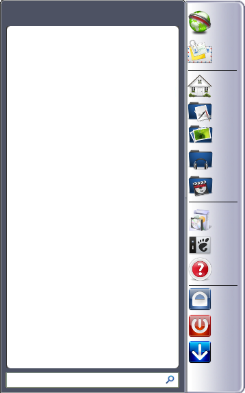
So Helder is fixing bugs and adding features. One of the blueprints he writes states that GnoMenu needs a default menu that is not so Vista like. In response Helder creates this look.

This was more a step backwards in many respects since many features were no longer available. Though for GnoMenu's future it was necessary. Why, because it forced change in how we looked at menu designs and what it was we wanted GnoMenu to be. It also forced Helder to make GnoMenu compliant to Gnome's Menu standards. It also stopped us from reinventing the wheel and made us get more serious about the future of this project.
The holidays role around and Helder goes on a hiatus to handle personal issues and be with his family. I in the meantime find myself getting pounded with a whole lot of questions and bug reports which I sort through and file appropriately. I make FAQs and blueprints. Validate some bugs and assign them to an appropriate release. Discover there are themes out there that don't like GnoMenu and with help get the fix. Though small there is a community of GnoMenu users out there and they're helping me by providing information and tracking down those unique if not down right out of the Twilight Zone issues.
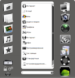
Finally things calm down and I get a chance to go back and look at the menu design. Helder's design was just terrible and it ruined many things that made GnoMenu great. So what do I do in response. I make this mockup and post it at Gnome-Look to get feed back on it.

The responses were mixed but everybody did like the idea of using Icons instead of words. The fact is we humans are visually orientated creatures. The use of words is something our brain has to be trained to do. Don't get me wrong, reading is very important but we recognize visual cues much easier. It is the main reasons that television became such a powerful and popular form of media delivery. It is second to none, even the Internet. Though as more contect becomes available on the Internet we will eventually be using it to get our television shows and information feeds.
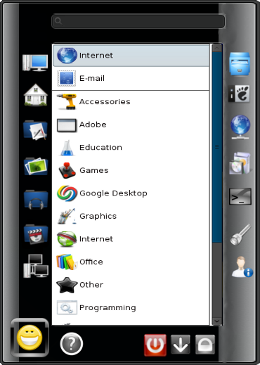
Next step is the community gets involved and two days after my mock up design is posted we have this design pop up.

Even the still on hiatus Helder popped in a comment on this Theme. It broke the mold. (By the way, this is an actual working theme.) Its a large menu theme and just a bit disorganized but it raised the bar and immediately brought more life to GnoMenu and Both Helder and I were duly impressed. So impressed that there wasn't much doubt how the new default theme was going to be laid out.
I created this layout as a possible canidate:

Much smaller, a bit more polished and very professional looking. Now I'm not saying this is, or will be, the next default theme for GnoMenu 1.7. What I'm saying is that because we stepped back and reworked our ideas GnoMenu evolved. We took our ideas to the community and got an explosive response in return. So explosive GnoMenu took a major leap forward with a whole new look and feel. One that is much more Gnome centric and yet beatiful and functional.
Now if your saying to yourself that I did nothing but talk about GnoMenu then you missed the whole point. That community driven projects can and, in many cases, do outpace closed sourced development cycles. Here's why, ideas pile up on each other as each person whom gets involved takes the idea of the previous person and adds to or improves it. In my case I wanted to return functionality without destroying Helder's desire to have something completely different from a Vista look a like. That was the main driving reason for the Icon usage. Plus it has another major advantage. Words are not universal, pictures and images are. Words have to be translated to languages others can read, pictures and images do not. So long as they follow a universal concept. This effectively solves a major issue in translation problems. Though we still have to do it, the pressure to do so will be a lot less.
ZWS the creator of the Black White Theme probably had very different motives behind his design but none the less he made a huge impact. An impact that will carry GnoMenu forward for a long time to come. Though on rare occassions this may happen in closed source development It is far more likely to happen when design and development is open to the public.
What I want to point out especially is that by taking my basic idea and throwing it out and making sure people knew that it could be done, it did. Far better than I expected it to as well. So very often I see projects that lose track of what it really means to be an open project. Anyone can add value and sometimes users have great ideas. To often we as project leaders fail to listen to those ideas. More often than not we should.
No comments:
Post a Comment